
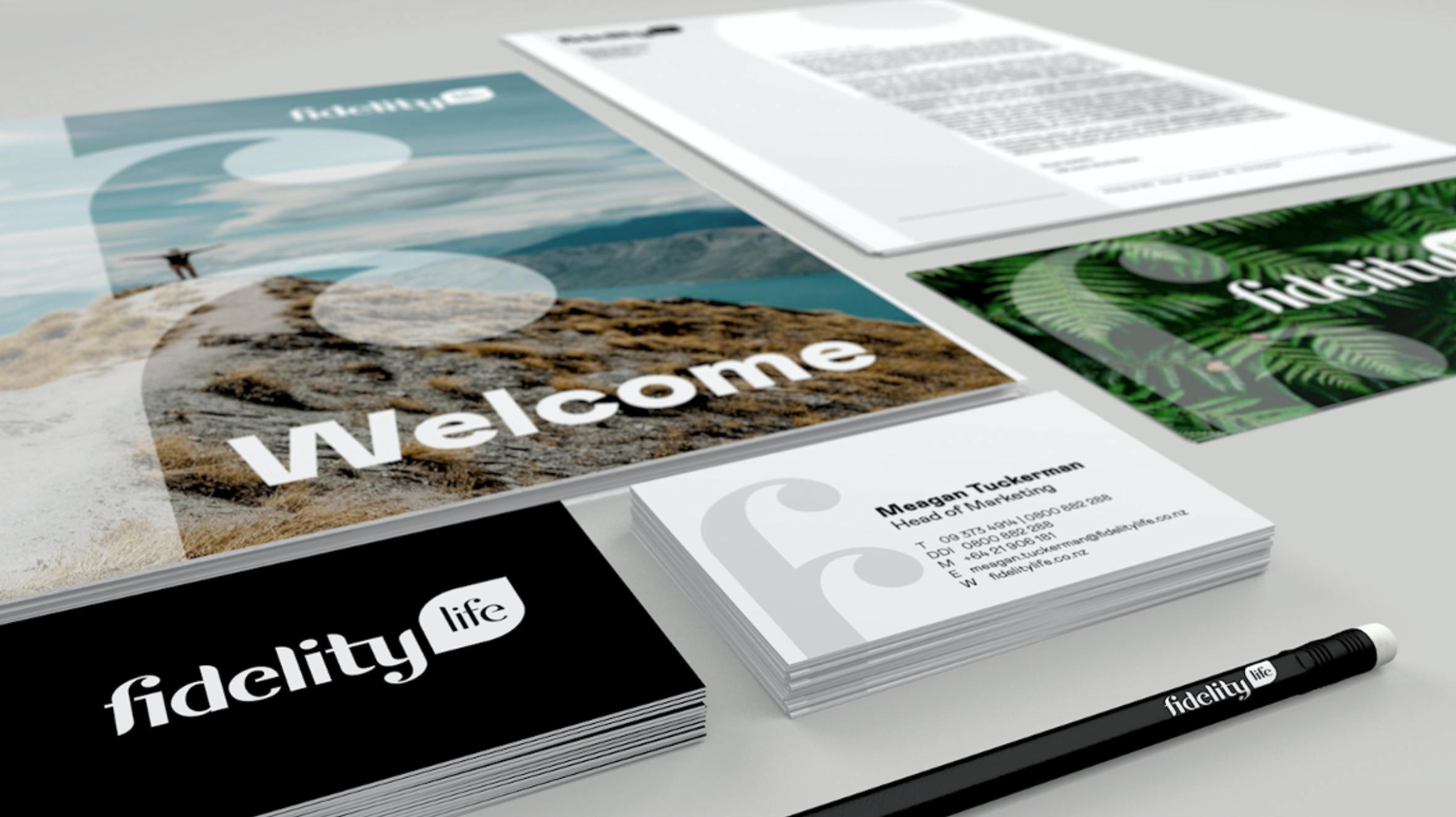
Fidelity Life wanted a fresh brand that better connected with customers in New Zealand.
We developed a brand idea ‘Live Positively’ which was built from their promise to protect customers lives and a belief that life is for living.
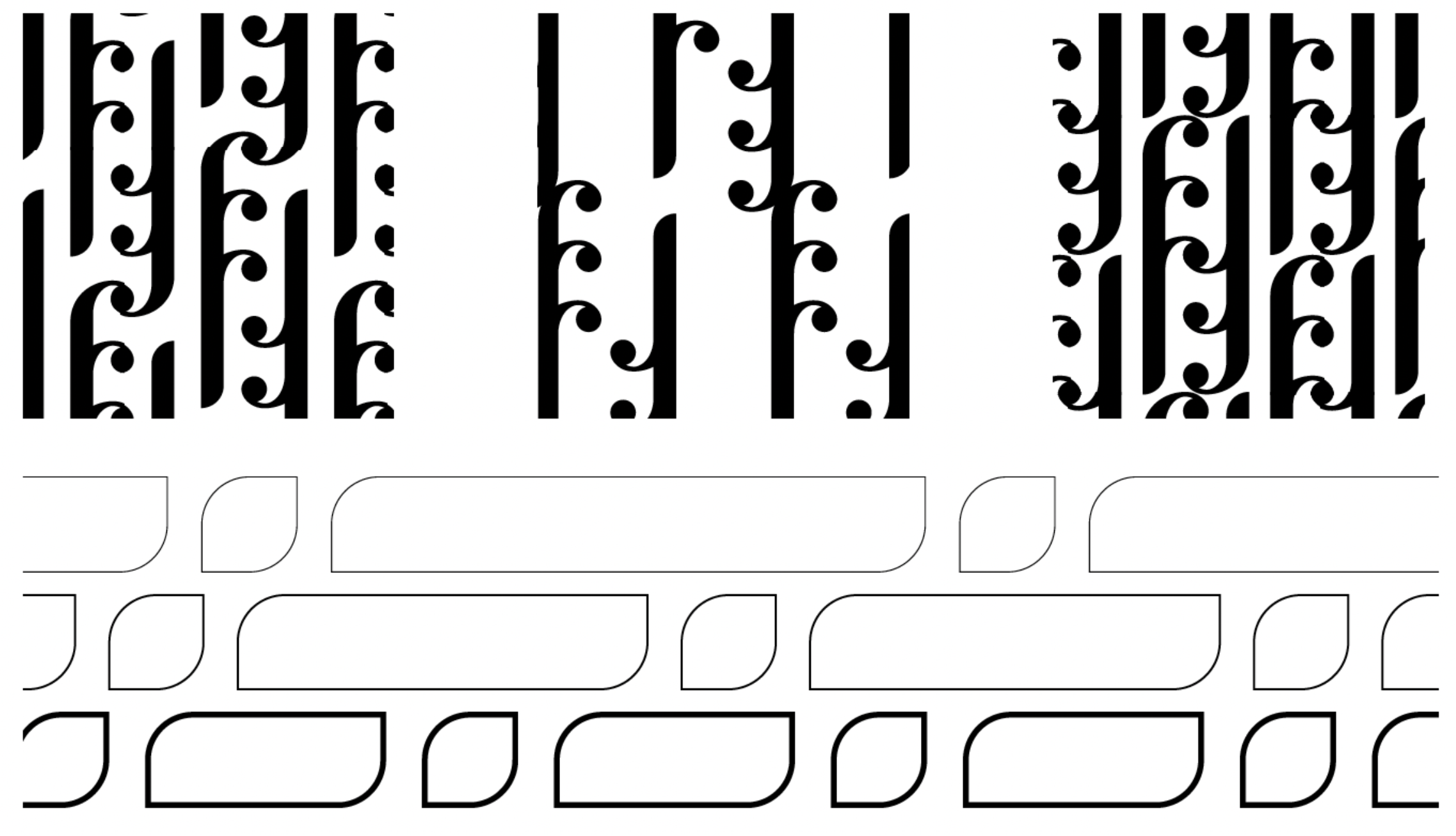
We embedded a sense of familiarity and connection to nature in the new identity with the fi letters representing a hug symbolising support, care and strength and the form of the letters inspired by the fern frond and Koru, associated with nurturing, free spirit and closeness to nature.


Credits
Agency: Proximity/Clemenger Group
Creative Director: Danielle Barclay
Design Director: Matt Oak